A Budget-Friendly Interactive Analysis
Case Study 3.8
How GVM Utilized Data to Give Customers the Website They Want
When GVM, a manufacturer of agricultural equipment, approached Graphcom for a redesign of its website, we began by gathering data. Understanding the user experience and what motivates customers to take action was key to redesigning the website.
The Challenge
GVM’s website had been live—and unchanged—for several years. Some of the functionality was outdated and the layout was becoming stale, so the site needed a refresh to keep up with best practices in web development. The challenge was to create an updated and budget-friendly website that appeals to the modern consumer. GVM turned to Graphcom for our expertise in web design and development, UX analysis, SEO, and Google Analytics to accomplish this goal.
The Solution
Conscious of GVM’s budget and goals, we decided a page-by-page approach to the redesign was the best course of action. First, we performed a site-wide interactive analysis to understand visitor behavior patterns. We looked at both the most popular and least popular areas of the website to help us be strategic with our redesign recommendations.
The interactive analysis involves analyzing technical website data (site analytics and SEO data) and contextual website data (user experience) to gain a holistic and comprehensive understanding of how visitors interact with the website. Using that data, we could eliminate the guessing game of what to add, remove, or change on GVM’s website; instead, we were able to make informed and intelligent recommendations. Here are some of our findings.
The Results
Making Navigation Easy
Using heat map data, we determined the most popular areas of the website and the most popular links that users were clicking. In the main navigation, three links had 40+ clicks, while the other two had less than 30 each. In the top navigation, two of the links had 50+ clicks, while the other three had less than 15. So, we reorganized the navigation to swap out poor-performing links with higher-performing links. This ensures the most relevant information is at the top of the webpage, where users can easily find them.
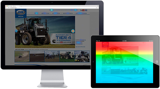
The heat map on the left shows what users click on and interact with. The heat map on the right shows a color gradient, which gives a visual representation of how far users scroll down on the page on average. Warm colors indicate a higher density of user interaction.
Maximizing the Slideshow
Using a combination of heat map data and recorded visitor session data, we found that the slideshow on the homepage was extremely popular—26% of all clicks on the homepage were on the arrows allowing users to browse the slideshow pictures. However, less than 1% of the total clicks were on the actual images, which were originally designed to take users to other pages of the site.
It was obvious that the images were attention-grabbing, but with no call-to-actions (CTAs) on these images, visitors didn’t know what to do next. To capitalize on this heavily trafficked area, we placed a CTA on each slideshow image to pull people deeper into the site.
Optimizing Page Load Speed
The search engine optimization (SEO) report revealed that GVM’s website was not loading at an optimal speed of at least 75/100 or higher. The desktop load speed was 33/100, and the mobile load speed was 30/100. We discovered that certain elements of the website were outdated, saved at too large of file size, and blocked proper rendering of the website, which caused the website to load slower. We were able to streamline the backend code of the website to help it load faster and function at an optimal level.
Clarifying Map Functionality
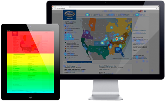
Customers looking for their local dealer of GVM equipment rely on a webpage that shows a U.S. map above an alphabetized list of agricultural dealers from around the country. We discovered that 69.77% of visitors were clicking on the image of the map to find a dealer near them—but they were out of luck because the map was just a static image!
For the 88.9% of visitors who scrolled down to the alphabetized list of dealers, we discovered by watching the recordings of visitors using this page, that the users expected the list to be organized by state (when in fact, it was organized by dealer name). Our future recommendation is to list the dealers by state and replace the static map with an interactive one that will help visitors find a dealer near them.
Increasing Contacts
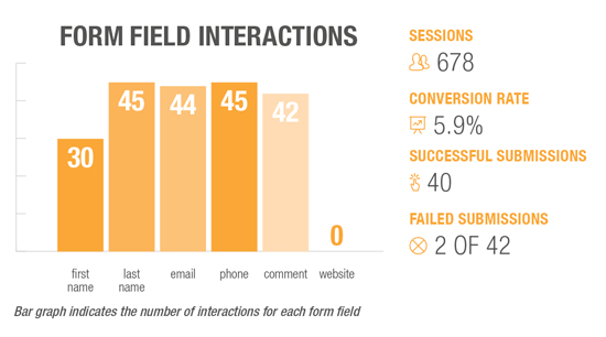
How effective was GVM’s Contact Us form? Using form analysis data that measures drop-off rate, conversion rate, and overall form effectiveness, we learned that not all of the existing form fields were needed. While most form fields recorded roughly 30 to 45 interactions each, the website form field received zero interactions. This was not a required field, so visitors skipped it entirely. Knowing this, we recommended that the website form field is removed to shorten the form and aid in increasing the conversion rate.
Key Takeaways
of 100 mobile page speed score for UX
of 100 desktop page speed score
%
conversion rate for form submissions
What’s Next?
After collecting and analyzing user experience and SEO data, we combined the information into a comprehensive interactive analysis report and presented our findings and recommendations for improvement to GVM. Although GVM had originally asked for only a redesign of the homepage, after reviewing the interactive analysis report, they see the value and importance of improving and redesigning other elements of the website as well.
Currently, GVM and Graphcom are working together to redesign the homepage and improve site functionality, using data to strategically build the most effective and user-friendly website.
Since the launch of the website, there was a
%
conversion rate for form field interactions
Want Results Like These, Too?
Let’s talk. Together, we’ll analyze your website and improve site functionality, user experience, and results.