The Power of User Experience (UX)
White Paper 3.3
Where Website Design & Function Meet
Putting the Right Foot Forward
First impressions are unforgettable. In a matter of seconds, viewers make judgments about brands, products, and companies based on simple interactions. One of the most common ways they do so is by looking at a company’s website.
User experience (UX) is all about meeting user need—or making a website as user-friendly as possible. Normally, UX involves reviewing and refining the effectiveness of the website’s design and function.
Bad UX design and function is a one-way ticket to lost revenue and audience loyalty. In fact, 48 percent of users say that arriving on a site that doesn’t work well is seen as an indication that the business doesn’t care about their brand, their reputation, or their customers.
In the simplest way possible, UX makes complex webpages easy to use.
A Step-By-Step Guide
A strong UX takes time and considerable effort, but with the help of an expert partner, the process is fairly straightforward. The process involves a harmonious relationship between web designers and web developers with one shared goal: to create an appealing and effective web space.
1. Gather Data and Analyze
Before you do anything else, take time to analyze how the website is performing in its current state. Run tests that determine the user or mobile friendliness to discover areas that need improvement. Site data (such as viewers per page), surveys, and research show what users are looking for when they interact with a site.
Interface testing identifies current holes on the webpage as well—buttons that don’t work, pages with slow load times, or links that are faulty, for example. With this information, the stage is set for improvement.
2. Develop a Buyer’s Journey
It all starts with determining the goal for a user interacting with a site. What should they experience? Is the goal donations? Sales? Gathering contact information? Whatever it may be, your predetermined buyer’s journey should lead users to the end goal on the site. The best way to accomplish this is through a simple, clean, and concise layout—something that is simple to navigate. Create a workflow of how users move through the website currently, then make another indicating how they should navigate the site to accomplish the goal.
3. Create a Sitemap
A sitemap takes all of the information collected so far (data, workflow, diagnostics, etc.) and creates a visual space for the site’s navigation. The order of the pages should reflect the data collected and the buyer’s journey established. At this stage, there is an opportunity to play around during testing, so there is a concrete vision on the path that best points the buyer to the goal.
4. Test, Test, Test
It all comes full circle. Testing is the only way to really know if the efforts are working after applying changes. Seeing more website views or increased sales? Something must be working right. Aside from this, running diagnostic checks consistently identifies new problems or ones that may have been missed. The faster these problems are identified and fixed, the lower the chances that UX will be impacted.
In the end, a solid UX creates a space where visitors can find what they’re looking for and organizations can get what they need—stronger reputation, higher ROI, and increased site visibility.
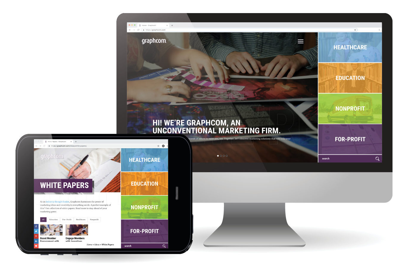
The new Graphcom website is all about meeting user need. The homepage, for example, places emphasis on and gives direction to four target markets: healthcare, education, nonprofit, and for-profit.
By showcasing thought leadership and expertise through white papers and case studies, the Graphcom website leads users to the end goal of moving from a prospect or lead to client.
Who is Graphcom?
At Graphcom, we understand good design and good user experience. We use our very own method called interactive analysis to understand your website needs and then implement results with both flawless design, engaging copy, and strategic web development.
As your partner, we can assess your current webpages to find problems and then provide the resources to fix and monitor them. Our web development team creates seamless functioning between your front-end components and back-end structure, keeping SEO, UX, and mobile-friendliness top of mind.
Recently, we implemented many of these best practices when redesigning and developing our own website. At www.graphcom.com, you can see how we married creative design, targeted messaging, engaging content, thought leadership, and user experience and functionality to create a site that’s truly designed for our target audience.
Our goal is to take your users’ online experience to the next level, showing your visitors your expertise and exactly what you have to offer.
Our Capabilities
Diagnostics Checks // SEO Integration // Web Development // UX Analysis & Design // Mobile Web Development // Responsive Web Design // Web Content & Copywriting
Does Graphcom Sound Like a Good Fit for Your Organization?
Let’s talk. We’ll get started with your interactive analysis and UX design process.


