Renewed Visions: Adams County Library System’s Brand Transformation Journey
Case Study 1.7
Adams County Library System Modernizes, Prepares for Fundraising with New Branding
The Adams County Library System serves approximately 91,000 residents through six library facilities and a bookmobile in Adams County, Pa. In 2014, the library embarked on the feasibility phase of a capital campaign to renovate its historic, 100-year-old building in downtown Gettysburg. The goal was to build a flexible, adaptable, forward-thinking infrastructure for the 21st century.
The Challenge
The library initially approached us to help with marketing for the capital campaign itself, but it soon became apparent that the library’s current branding did not meet its vision for the future:
“The way we access and use information has completely transformed in the nearly 70 years since Adams County’s first public library opened. As libraries have moved from card catalogs to online databases, from print to microfilm to digital publications, their community role has shifted, too.
The library that once served as an oasis of information is now here to help you navigate today’s deep, shifting sea of available resources. While our mission will always include providing information, we must now expand to provide access to new technologies, space for creation and collaboration, and enhanced programs for learning and exploration.”
Together, we began a rebranding process to illustrate how the library provides modern, relevant services for the 21st century. With a complete overhaul of the library materials’ look, feel, and message, the result is a new image in the community that strengthens the library’s case for support from future donors.
The Solutions
Until 2013, the library’s logo was a simple line drawing of the library itself. While it paid homage to the building’s history and Gettysburg’s heritage, it also conveyed an outdated image of what a library can do or be.
After a kickoff meeting with the client and in-depth research as to their goals, audience, and the future of libraries, we developed some ideas for modernizing the library’s look, feel, and tone. We began creating logo designs and basic messaging. We like to give our clients at least 3 logo options:
- Calm – A logo that, while new and fresh, will feel familiar and comfortable to the audience.
- Creative – A logo that adds an unexpected element, often surprising or delighting the audience.
- Courageous – A logo that turns around the image and voice of an organization, pulling the audience in a new, invigorating direction.
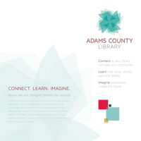
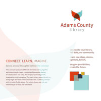
For the library, we created four logo designs. The staff selected the “courageous” option, which has a shape that symbolizes:
- Three open books
- Three open laptops
- Six branches of the library join together as one cohesive unit
Once the shape was finalized, we recommended three distinct color options, again ranging from calm to creative to courageous. The client again chose the courageous option, and their color palate was born.
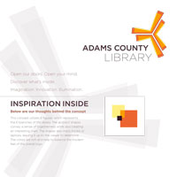
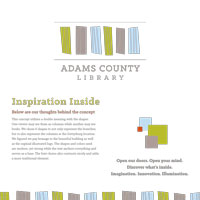
Supporting Materials
At Graphcom, we know that a brand is only as good as the consistency with which it’s used. So we developed an easy-to-follow standards guide to help the library determine correct usage of the new branding (see below).
After any rebranding initiative, an organization immediately needs new stationery. We designed letterhead, envelopes, and thank-you cards for the library, all of which were printed at Graphcom’s facilities. Each time they are used, the library brand grows stronger. An electronic version of the letterhead was also created, to allow the client to create simple Word documents to be printed on plain paper. We also created a PowerPoint template for presentations.
A named endowment brochure, which promotes the library’s named endowment program, was updated with the new brand standards. The 2014 annual report was also designed with the updated logo, colors, fonts, and photographs to strengthen the library’s new image.
Stealing the Show
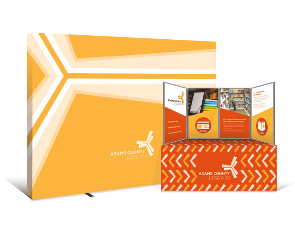
The library has a presence at many events, expos, fairs, and community gatherings throughout the county. With these newly branded trade show materials, the library steals the show wherever they go. Their booth consists of:
- Backdrop – The bright color and dynamic logo add a sense of dynamism and movement to any trade show display. The backdrop has also been used behind a podium at library presentations and speaking engagements.
- Table Drape – This drape, which fits any table between 6’ and 10’ long, keeps the library logo front and center.
- Stand-Up Display – The four-panel display provides basic information about the library, such as how to obtain a library card. Its construction allows it to sit far back on the table, making space to display books, brochures, and other giveaway items.
Making (and Testing) the Case
Graphcom worked hand-in-hand with library staff, trustees, and their capital campaign consultants, The Franklin Group, throughout the feasibility study phase of the project. From the beginning, we developed the library’s brand and messaging with the capital campaign in mind, and created opportunities to test whenever possible.
For example, the library’s case statement was designed in three phases: a first draft, which was tested on library staff during the feasibility study’s first phase; a second draft, which was tested on a feasibility study committee during the second phase; and a third draft, which was tested on prospective donors during the feasibility study’s final phase. From that data, we’ll be making final adjustments to ensure an impactful case for support that compels donors to be a part of their community’s 21st-century library.
Taking It Online
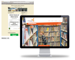
The Graphcom team designed and developed a new website for the library, designed to be intuitive, fun, and easier to use for both the library and site users. We not only incorporated the new branding, but also completely overhauled the navigation and interface, plus rewrote content to be consistent with the library’s messaging.
The new site allowed the library to easily update content and pages on their own. A responsive web design provided an optimal viewing experience—on any device—and we moved all social media plugins to the top of the homepage instead of buried at the bottom.
We approached the site’s navigation structure from a true marketing perspective, evaluating ways to improve hierarchy and organization. The previous site featured exhausting drop-down menus and no search field, forcing the user to dig for what they’re looking for. Our redesign featured new subsections that deliver content all at once, as well as a search form at the top. The new navigation was more robust, giving the user more opportunities to find and engage in the library’s services and resources.
“You’ve done an excellent job at listening to us and developing our story. It exactly meets the mission of Graphcom: the vision to communicate yours. Again, wow! Great job!”
Have a Rebranding or Capital Campaign In the Works?
We can help. Graphcom is your one-stop-shop for all things branding, marketing, and fundraising.